ShopDreamUp AI ArtDreamUp

Deviation Actions
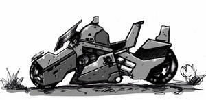
Synaptic Fragments
A view of how my Alien-Hybrid imagination stumbles through this existence via rough sketches and ideas.
$2/month


Suggested Deviants


Suggested Collections


You Might Like…


Featured in Groups


Badge Awards
Description
Service station of the space !
personnal work, about 4h.
I hesitated to publish , I try to put the best , but I thought it was a good "speed matte painting", so what do you think ?
Hight rez :
www.artstation.com/artwork/ser…
personnal work, about 4h.
I hesitated to publish , I try to put the best , but I thought it was a good "speed matte painting", so what do you think ?
Hight rez :
www.artstation.com/artwork/ser…
Image size
1920x1080px 1.32 MB
Comments45
Join the community to add your comment. Already a deviant? Log In
03.00.14.4.15
This sci-fi city, while being nothing new by itself, is conveyed in a much more believable manner than others of its kind.
The first thing that stands out with this city is the absence of the "sleek and sexy" style architecture that many people would probably envision for the future of living spaces. Most include super-sleek skyscrapers and sports car-style spaceships in organized flight lanes, usually with the lower class citizens living in the slum area at the ground level of the city. While that trope in of itself is not bad, it also isn't believable and, in my opinion, its more important than the Rule of Cool.
While the city does appear to be in layers, the city's buildings look much more believable, more like a normal city rather than one overrun with corporate ads and "flying car lanes." The main way of navigating doesn't appear to be flying around, and they skylines look clear for private commercial or distribution flights. Useless sci-fi babble, but important for me I guess. I believe things should be designed for their purpose, and seem to have done that.
Separate from the fiction is the technical skill. I cannot go too far in depth with that; as my own technical skill is just short of disgusting, I don't feel qualified to asses images of greater technical quality than I can produce. But anyone can tell you that it's well done. The perspective and lighting are spot-on, and the proportions are good. The colors are not overly bright and numerous and are pleasing to look at, as well as believable.
The only real issue I saw with the image after viewing it for a while was the lack of a focal point. My guess would be that the "Fuel" sign is supposed to catch the eye first, then it travels along the closest ship towards the ground, to the sporty-looking ship, and then to the docked ship. But the orange-colored walkways are also competing for attention, as are the multicolored lights in the background. Also, some of the spaceships appear to be going somewhere, but seem out of place, especially with all of them moving in the same direction. That's just how I'm seeing it; of course others may see it differently.
The image, while lacking originality in concept, is superb. But then again, a city's architecture has to change around at some point, so it's a required trope? It's believable and well done though, especially for 4 hours, so I'm content.